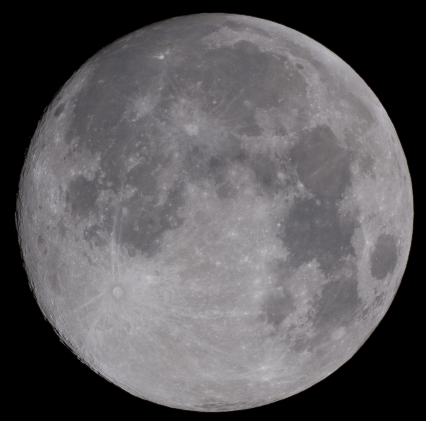
There's a lively debate, among photographers, on the benefits of shooting RAW or JPEG. Shooting the colours of the Moon gives us an perfect opportunity to experiment with both file formats. Let's grab a Canon 40D and take a few shots of the nearly full moon through a cheap 800/200mm (F/D 4)telescope. At first, what we get is a rather bland looking moon (100 ISO 1/800s sample raw file 8.24MB) that doesn't seem to be that interesting.
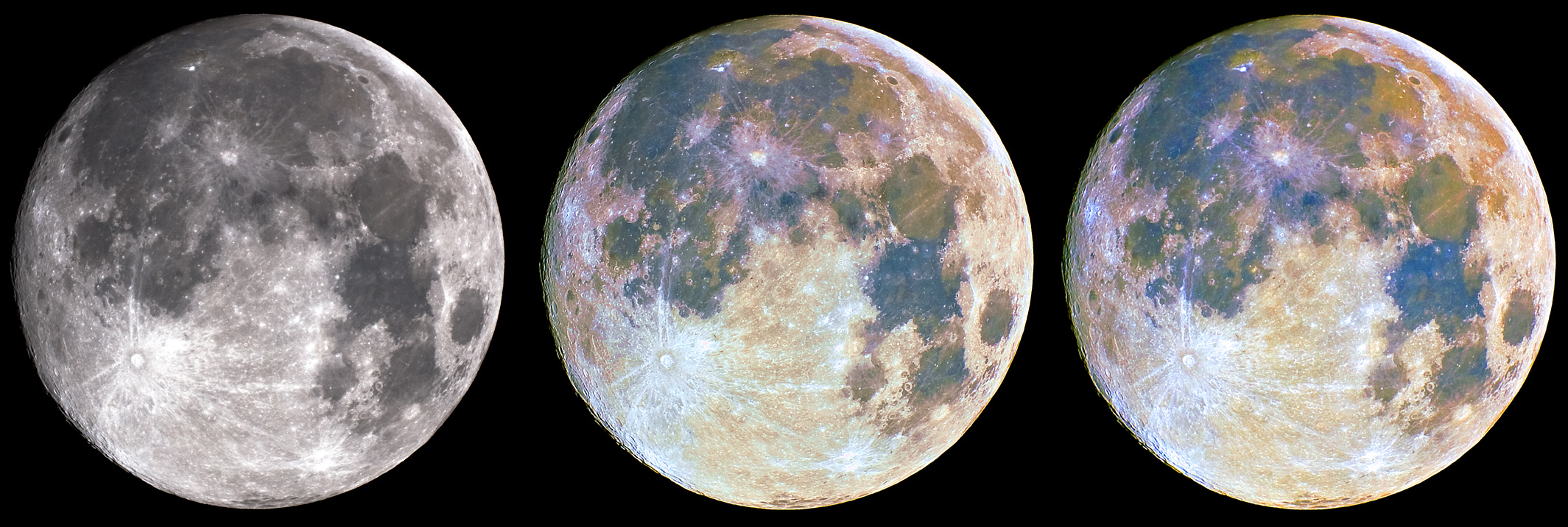
It will, of course, have more punch once the contrast has been adjusted, but hey, this is still the same old grey moon we see everywhere, right? Wrong! As this multispectral image taken by the Galileo probe demonstrates, the moon is a very colourful object. The nuances, which reflect the composition of the underlying lunar material, are very subtle though. Since we don't have the luxury of sending a probe equipped with advanced cameras and narrow band filters beyond the atmosphere, we'll have to extract the colour information from our DSLR's bayer matrix. Lets focus on the Mare Tranquilitatis area - the site where Apollo 11 landed - whose bluish titanium rich basalt contrasts nicely with Mare Serenitatis's orange lavas.
Pure JPEG Approach
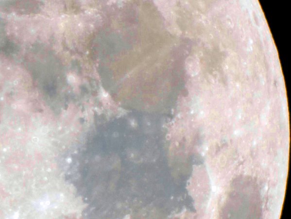
Here's what happens if we start from the default jpeg produced by the camera, at the highest quality setting, and attempt two Photoshop passes, each consisting of an "auto-color" adjustment, a contrast adjustment and a saturation increase. The blue and the orange are there, sort of, but they are so insipid! Worse, you simply can't increase saturation beyond a certain level because the already obvious color artefacts visible in Mare Serenitatis are just about to take an awful posterized look.
A competent Photoshop user, with a lot of tweaking, curve play, and advanced editing techniques might be able to extract a bit more color out of the jpeg, but the upside is clearly limited.
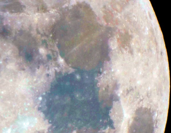
RAW Approach
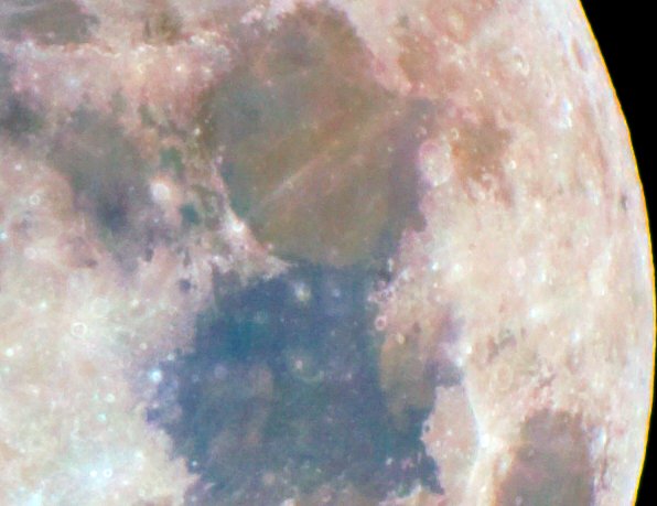
Now, let's take a look at what we can extract from the raw file. In this example I have used Lightroom (but I could as well have used ACR 4.3 or any other RAW converter) to set both the contrast and the saturation of the image to the maximum before importing the adjusted file in Photoshop. I have, again, done two passes consisting both of an "auto-color" adjustment and a saturation increase. Not only do we get more vivid and nuanced colours, but the image generally behaves much better, barely showing hints of what had become major artefacts in the JPEG above.
The experienced eye will notice that we do get a tiny bit of noise in the coulours. Remember, when one says that "the colours of the moon are very subtle", one actually means that the signal to noise ratio is low. While the Canon 40D is, arguably, the best current (late 2007) DSLR when it comes to signal to noise ratio, we are significantly stretching the data. We'll address the noise issue a bit later.
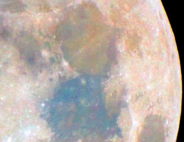
Corrected JPEG Approach
The JPEG advocate might complain that adjusting the contrast and saturation by +100 in Lightroom before loading the image in Photoshop wasn't fair. Well, when your camera shoots JPEG, you don't have the choice, do you? You have got to work with what it produces. But let's be gracious and let's use Lightroom to adjust the contrast of the JPEG before further edits. While, at first sight, the image looks similar to the contrast adjusted RAW file and while one can coerce it in producing more saturated colours... the image breaks down as much, and in some ways even more, than our initial JPEG attempt. When we "enhanced" the contrast on the JPEG, we killed the nuances and created areas that are so similar that the JPEG compression algorithm happily flattened them into not so subtle gradients.
Using JPEG as RAW
If, pushing fairness beyond what is reasonable, we use Lightroom to adjust both the contrast and saturation of the JPEG before loading it in Photoshop, the image litterally explodes as soon as we touch it. We get noise, artefacts and false colours.
Processing Notes
It can be argued that the three different JPEG approaches outlined above aren't really that different and aren't optimal. Indeed, changing the contrast or saturation in Lightroom is not necessarily better than doing it in Photoshop. And I certainly can't claim to be an image processing guru. But what is obvious in the JPEG workflows outlined above is how easily it breaks down because it contains much less information than the RAW format. Tackling the problem from one side leads to artefacts, looking at it from another angle suffers from unacceptable noise, keeping both artefacts and noise in check results in a very low signal. In fact, I had first planned to use identical contrast and saturation adjustments in both workflows, but that proved to be futile: after the initial contrast and saturation adjustment, the game was over. The jpeg images simply could not withstand equal rounds of saturation increases.
And what about the future?
There's a question I can't answer that is looming in my mind. Remember the first VGA images you saw? For me, they were images of the shuttle launch, on a NEC Multisync monitor. At the time, to our uneducated eye, they looked stunning, almost perfect. By today's standards, they are pitiful, grainy, full of gradients. What will a processed 8-bit JPEG look like ten years from now, when shown on a display with a wider gamut?
Dealing with noise
The best way to deal with noise apparent in low signal to noise ratio images is, of course, to stack multiple exposures. I stacked approximately 20 pictures for my final image. (click the link or the picture for 66% of real size)
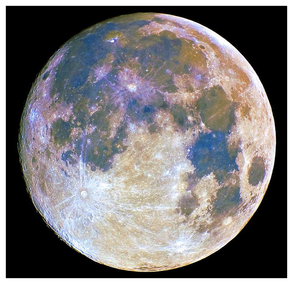
The noise decreases, but this comes at a cost: the quick and dirty image registration is less than perfect and the resulting blurriness had to be corrected with a small amount of sharpening. There is much room for improvement.
Final words
If you have stumbled on this page by accident, I do not want to conclude this writeup without making clear that I did not invent the "Colours of the Moon" technique. I don't know who did (please mail me if you do). Many people have produced wonderful images showing the colours of the Moon (see for example Russell Croman's image, taken with a 20 inch professional instrument). They have been an inspiration, and the source of a fun project on my first night out with my 40D
Pierre Vandevenne Pierre's Atsro Home Page